NOTE: All of the research discussed here was completed in HIST-666, taught in Fall 2014 by Dr. Fred Gibbs.
QGIS
When you don't know about something, you never see or recognize it--but once you do know about it, it's everywhere. This has been the case with QGIS. I had never heard of QGIS before my first digital humanities/methods seminar last year, and I haven't stopped hearing of it since. As I stated here, my first foray into maps never went beyond Google Maps. I was quite happy with what I had managed to produce, and I have to admit that I found QGIS intimidating. When you encounter something that you're not familiar with, it's natural to feel intimidated. It's also natural to want to push the new-and-scary-experience aside and not deal with it until it's absolutely necessary. That time came this semester. Even though we covered QGIS in the fifth and sixth weeks of class, it wasn't until much later that I sat down and figured the whole thing out.
QGIS is open source, which has its advantages. It's free to the public, and people can make changes as they see fit. It also has some disadvantages, like the outdated tutorials, for example. I downloaded the most recent version of QGIS and I wanted to know how to import maps into the program. The tutorials I came across were outdated, including the tutorial that proved most helpful. It was the most helpful because it walked me through how to download the necessary plug-ins, but when it came time to install and implement them, the tutorial did not jive with my version of the software. It wasn't until I sat down with a few colleagues to work on QGIS and other programs that I figured out how to make the map layers show up. As it turned out, the tutorial was based on an older version of QGIS which had the maps listed under a different menu heading than the version I was working with.
With the help of the same colleagues, I was also able to figure out how to take my Google Maps file and plug it into QGIS. I did this by taking the file from Google Maps and converting it to a KML file in Google Earth.
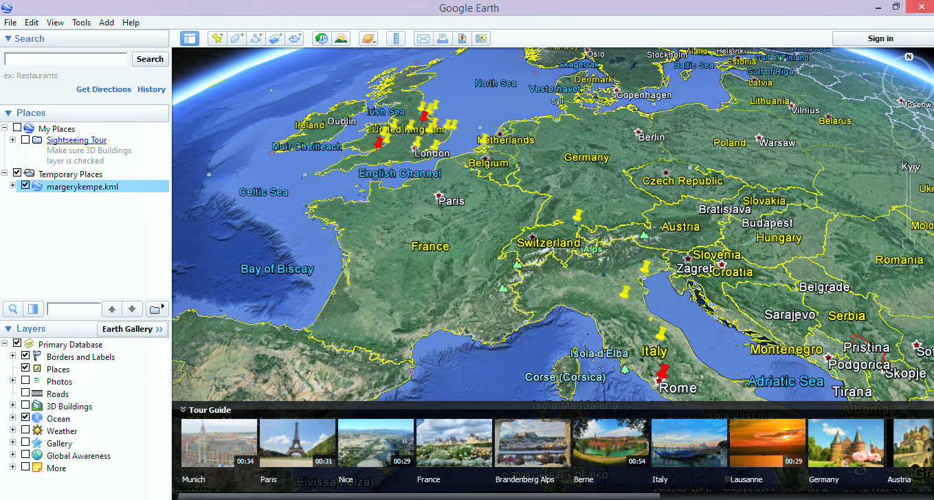
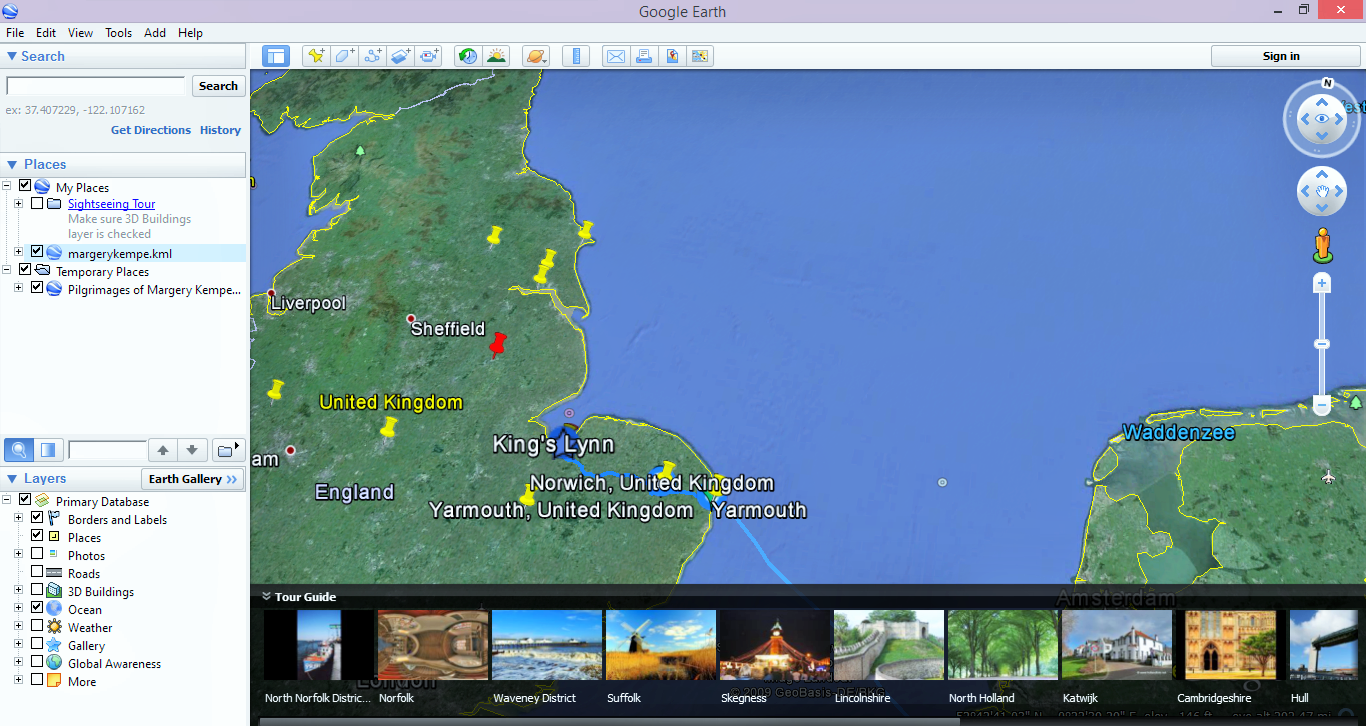
I then took the KML file and opened it in QGIS.
The first time I did this, it didn't work exactly the way I had planned. I opened the Google Maps file first so the plot points of Margery Kempe's route were on a white background. Then I opened the map from the plug-in menu and the dots disappeared. They only showed up briefly, flashing through the map layer, as I moved my mouse across the map. It's then that I discovered that it matters what order the layers are in. The first layer should be the map so that all the other layers can rest on top of it. Fixing this was a simple matter of clicking and dragging the files into the right order.
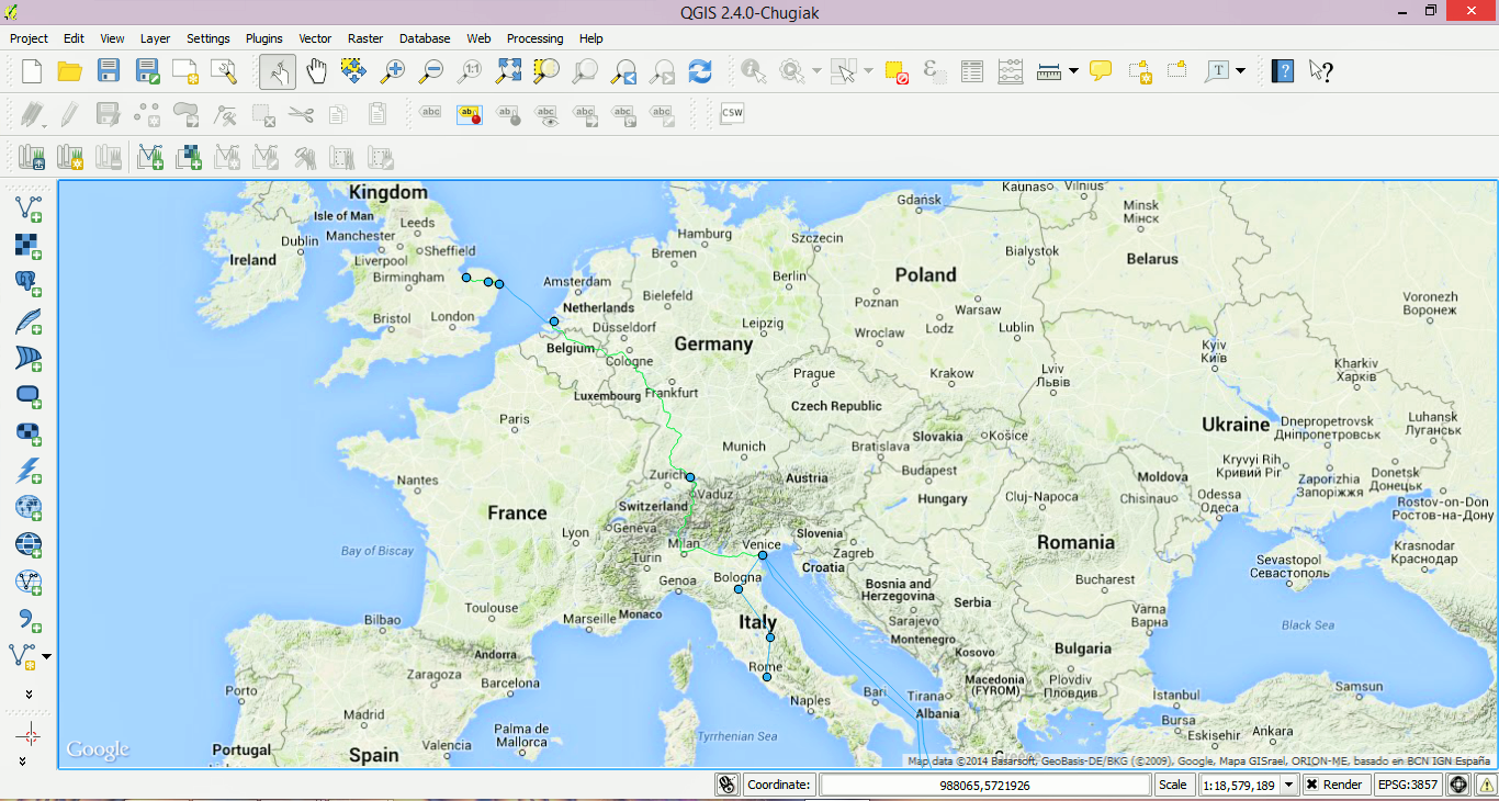
For my research on medieval pilgrimage routes and sites, I know that QGIS will be useful. Even though it isn't exactly user friendly, using it in conjunction with Google Maps and Google Earth will make it more so. I know that at this point I am not fully versed in everything that QGIS has to offer (although UNM does offer some continuing education classes on it), but even at this point I can recognize that it is a powerful tool that I can use to make my research on pilgrimage all the more vibrant and relevant.
BASIC WEB MAP
This semester I made a few more maps with the assistance of Google and their tutorials. The first map is a basic map of my hometown, Gowanda, NY.
If you look at the code, you will notice that the zoom value is at 10. The tutorial had me make a map of some other place in the world and provided the zoom value of 8. Since I wanted to see if I could make a map with my own information, I looked up the latitude and longitude of Gowanda and plugged it in with the same zoom value. This is what I got:
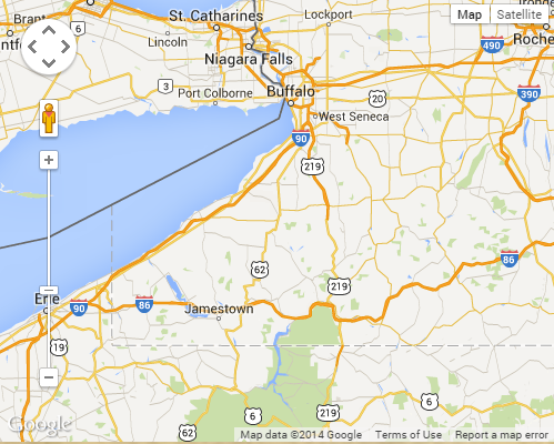
Not exactly what I was looking for. I wanted Gowanda (a very small town in Western New York) to display prominently, so the viewer's eye would immediately be drawn to it. The first evening I left the map as it was with the zoom value at 8 and went to bed. But even in bed my brain kept whirring away and I eventually remembered the zoom value. "What if," I wondered, "I changed the zoom value to something else?" I decided that I would do that next time.
When I was working on the map again, I changed the zoom value to 20 so I could be sure to see the difference. I knew then that 20 was too small for the zoom value, so I went to 15.
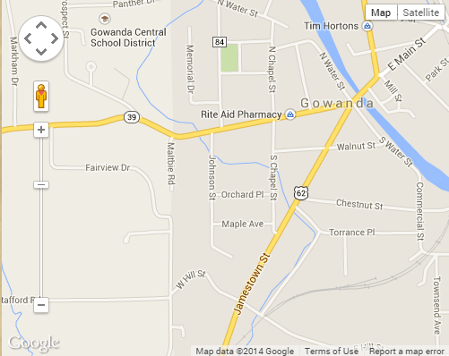
Still too small. I went down to 10.
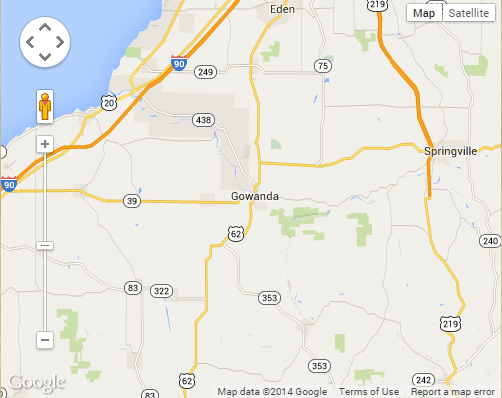
Perfect! All I needed to figure this out was a little time away from the problem. Even though we may not be at our desks physically working on projects 24/7, it doesn't mean that we're not thinking about them as we do other tasks. Indeed, some of my best ideas come to me while I'm doing something else, like trying to fall asleep.
This is the actual web map, so feel free to zoom in and out!
I made my second map by using another tutorial at Google. This time I made a map of a few restaurants that my husband and I like to frequent. This map wasn't as involved or detail-oriented like my hometown map, but I liked the end result nonetheless.
This map has various plot points which denote the different restaurants. The user can click on any (or all) of the points to get more information: the address, phone number, website, etc. And the viewer can see where all the restaurants are in relation to each other. They can also make their decision about where to eat (because who wouldn't trust my recommendations?) based on where they live.
CLEANING DATA, WEB SCRAPING, & PYTHON
Taking data and making it clean is something that I've discussed in some detail. Looking back, I think this part of the class was probably the hardest for me. Not only did I have to find data to clean, but I had to figure out Python scripts in order to do so (not to mention installing BeautifulSoup4 and this thing called "pip"). In many ways, the Programming Historian proved helpful. I was able to take their basic tutorials and scrape information from a website of my own choosing. Instead of scraping information from The Old Bailey Online, I scraped information from The Life of Thomas Becket, one of the saints I will probably be studying for my thesis. (You can find the text here.)
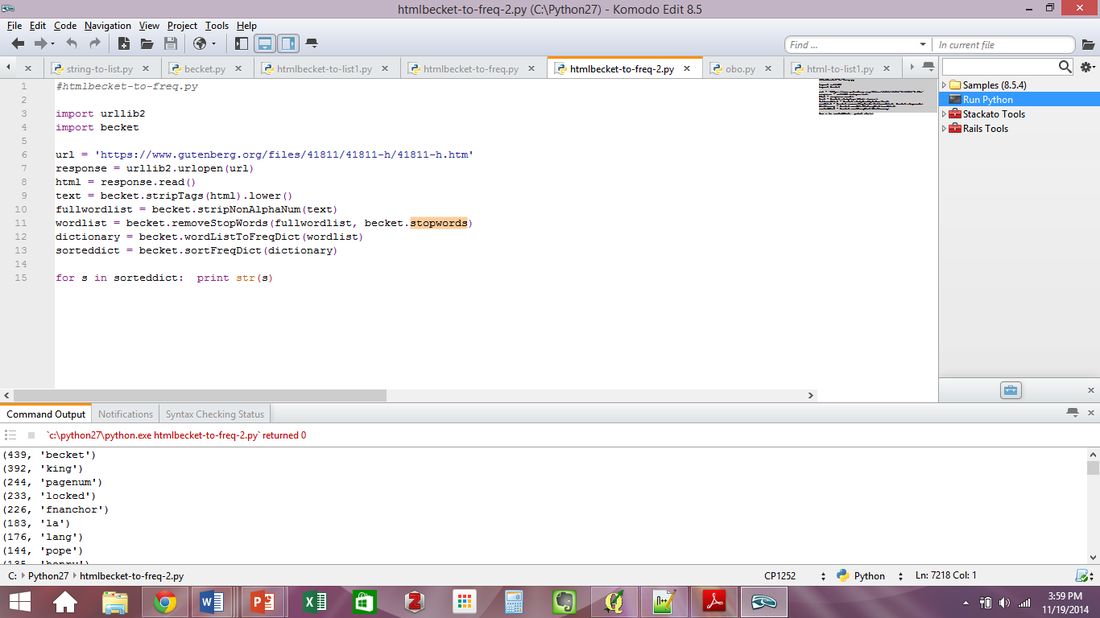
The tutorial gave me a good foundation in Python and what it is capable of, mostly. The first picture is of the information I got from the Python script-- just a long list of words and characters.
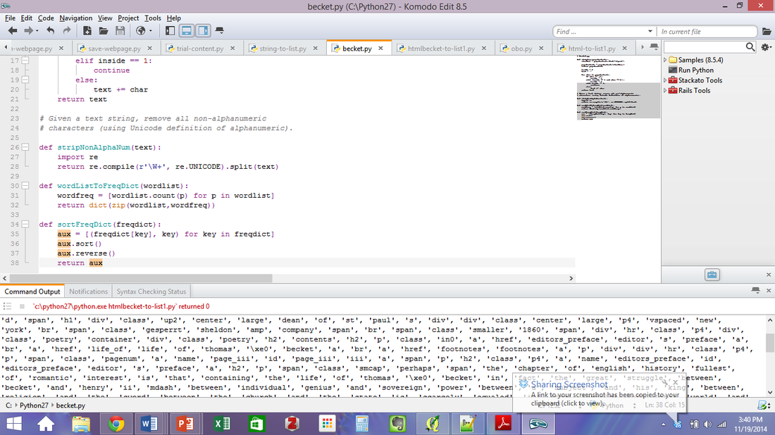
The second picture is of what the program returned to me after I whittled down what I wanted--only strings that contained words--no numbers!
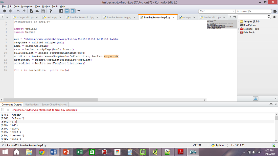
The third picture is of what the program returned to me after I plugged in more stop words. You can see that in the this picture the first (and therefore most frequent) word is "becket" whereas the most frequent word in the first picture is "d" and the most frequent word in the second picture is "span."
You can take a look at my Python scripts here, here, here, and here.
While I understand that Python is useful when one wants to get a lot of information from a website without going through it manually, I am not 100% convinced that I will use it in the future--whether for my own research or another project. At this point I think a lot of my apprehension and confusion with Python has to do with the fact that I am still not clear on what variables, functions, and strings are and what they do. It was here more than ever that I tried to remind myself of what Dr. Gibbs had been telling us throughout the semester: that programs like this aren't hard, they're just different, and it's like learning a new language. So in order to understand these new programs and techniques we need to change how we think. So even though I am still fuzzy on this whole Python thing, I can at least say I've tried it and I would be willing to try it again (and other new programs as well).
TEXT MINING
Text mining with Voyant was probably the most fun task out of everything we covered this semester. I think this is because I used papers that I had written for previous graduate seminars. So in this case, I was already familiar with the texts I was analyzing, unlike my foray into Python. With that being said, I already had a good idea of what the texts had in common: medieval pilgrimage (big surprise, right?)! Maybe it was because I already knew what the texts contained that I was so excited to see what Voyant produced for me (once I plugged in the stop words, of course).
I am not sure what I would think of the results of texts that I wasn't familiar with. I would certainly need to remember to plug in stop words so I wouldn't get useless information on words like "the" and "a" and "and." And I don't think the program would give me any useful information that I could use without reading the text in depth for myself. Overall at this point, I think Voyant would be most useful in verifying what I find through my own reading--which is exactly what it did with my seminar papers.
You can read about another experience of mine with Voyant here.
MALLET
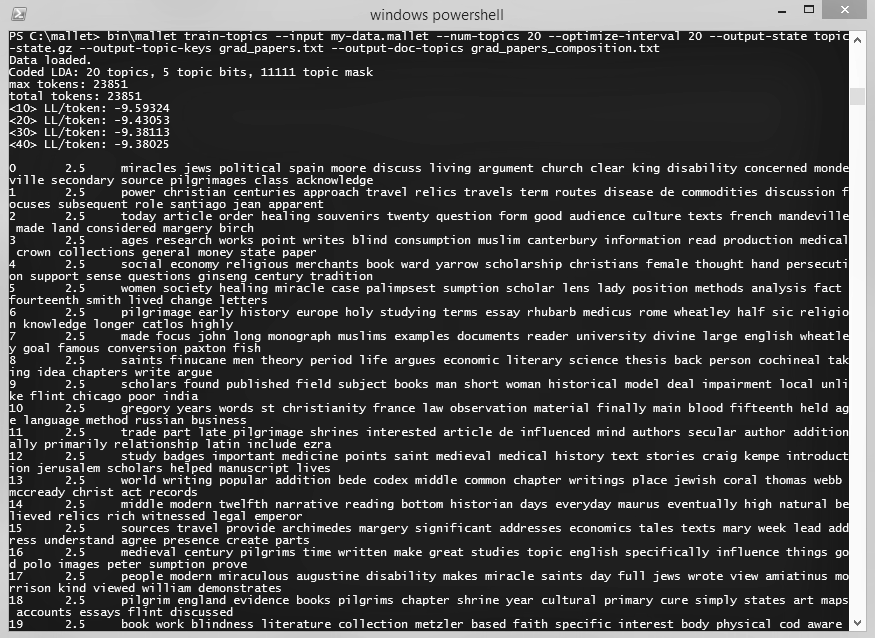
I used the same texts for topic modeling in MALLET that I did for text mining. Here again I relied on the tutorials found at Programming Historian. I think I must have missed a step, though. Once I went through all the steps and got the topics and frequencies in an Excel sheet, I still couldn't figure out what words the numbers were corresponding to.
But I was able to get some useful information--much like I did in Voyant--by plugging the text files in to Overview.
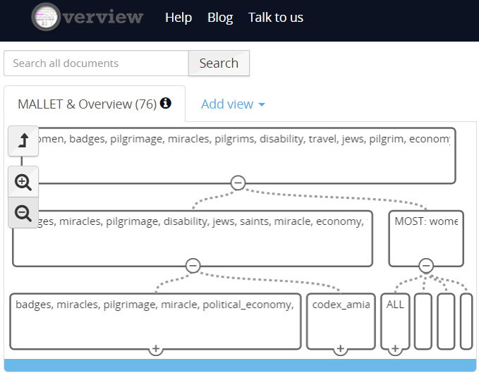
In the end, I was not that impressed with MALLET. I don't understand why the program could write the topic numbers and frequencies to an Excel file but neglect to include the words that correspond to them. Thankfully, Overview was able to give me a better idea of what I was (potentially) looking at in MALLET. Next time, I think I will use Overview in conjunction with Voyant, especially if I want to see how the same texts are analyzed by two different programs.
You can check out the files I used for text mining, MALLET, and Overview here, here, here, here, , and here.
RESEARCH VIDEO
My research video visually highlights what I have done so far for my MA thesis while I discuss my plans for its future.
MEDIEVAL STUDIES & DIGITAL HUMANITIES
It seems anachronistic to pair "digital" with "medieval," but that's exactly what current scholars are doing. We are all over the internet--on Twitter, Facebook, various websites and blogs--and we're finding new and innovative ways to study and present our data thanks to digital humanities.
The Bayeux Tapestry Digital Edition is one of the first medieval digital projects. Available as a CD-ROM and online, the project was undertaken by Martin Foys and it has now been well over a decade since its completion in 2002. It allows the users to scroll through a digital copy of the Bayeux Tapestry, with commentary and descriptions of each of its panels. It also includes a glossary of important peoples, places, and dates, a map of England and Normandy and 360 views of the battlefield. Other features include a search engine, bibliography, "museum," and a family tree of William the Conqueror. By scrolling through the various screenshots on the website, one gets the sense that the project is somewhat dated, but that shouldn't detract from its importance. With this digital medium, Foys has made it possible for the Bayeux Tapestry to be viewed by people all over the world (albeit for a fee) who might not have had the opportunity to view it otherwise.
Other scholars such as Timothy Stinson at are working on various projects that integrate the Middle Ages and the digital realm. A quick look at his faculty page at North Carolina State University shows that he has been and is involved in several projects such as the Piers Plowman Electronic Archive, the Medieval Electronic Scholarly Alliance, and The Siege of Jerusalem Electronic Archive.
There are even classes being taught on medieval pilgrimage. Through Duke University's Wired! program, Matthew Woodworth is teaching an art history class in Spring 2015 on The Pilgrim's Progress: Relics, Saints, and Miracle Seekers. According to the course description, the class will study the medieval cult of saints, church architecture, and then map the most popular pilgrimage routes. Students will also "use 3D modeling to recreate the appearance of a major pilgrimage church as it might have looked in the Middle Ages (including shrine, shrine base, altar, ambulatory, crypt, and iconography of wall painting and sculpture)."
These three brief examples help demonstrate that the new and emerging study of digital humanities is alive and well among medieval scholars. We can definitely see the trajectory that these digital projects have taken by juxtaposing Foys's Bayeux Tapestry project with Woodworth's class, and how far digital humanities within the scope of medieval studies has come in the past decade. For example, it would never have occurred to me in 2002 that in 2015 an art history class would be using 3D modeling to recreate a major medieval pilgrimage church.
Medieval scholars (and this includes me, if I may be so bold) have demonstrated time and again that they are more than capable of taking the digital methods and tools of today and applying it to the study of people and events that are centuries in the past.